Our Saviour’s Lutheran Church
This was a great WordPress website design project, because the client was challenging but also very communicative and timely with feedback and other things needed to keep the project on track. It’s always hard to have a project drag on much longer than anticipate because of delays in communication from the client.
I handled every aspect of this project from the website’s design through custom WordPress theme development and launch. It was a redesign, and the original website was over 5 years old, so it was long overdue for a more modern look and feel. It was originally built on WordPress, which was nice because it would be the first WordPress project I had worked on where the client was already familiar with WordPress.
Since it was a redesign, the website’s content was already there, but there was a fair amount of work restructuring and consolidating of pages that the client wanted to do. I insisted that we complete the content phase of the project first.
I have come to the conclusion that the practice of building the entire website design first and then forcing the content into the design is backwards. It is much more logical and efficient to have the content finalized first, and then build the website design around it. After all, a website is about its content first, isn’t it? Without content, it would just be an empty design, with no purpose.
I mentioned that the client was challenging because they were not impressed with my first design concept and they were not shy about telling me so. Unfortunately they didn’t give me a lot to go on in their critique, except that my design lacked “pizzaz”. I guess I made some assumptions (that turned out to be wrong) about the kind of design that a church would be looking for. At first I went with clean, safe concept, but this church was looking for more of a colorful, unique design.
Fortunately I did not take the initial negative and non specific criticism personally. Instead I worked with the client to get them to express more clearly what they were looking for, and as a result, I was able to deliver a second concept, which they were very happy with.
I created the mountain graphic used in the header is a simple illustration that started with a photograph that I took. It is actually panorama stitched together from several photos taken from the top of A Mountain in Tucson, AZ:
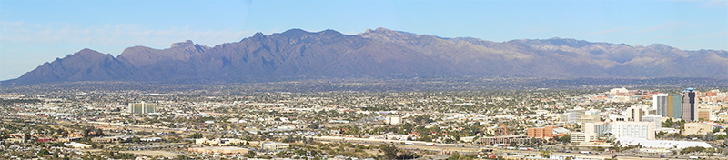
I traced the skyline of the mountains in Illustrator, then cam back through and added the canyon lines, so that I could use different shades of color to show depth. I went with a semi flat design concept, which was fun to do. A nice side benefit of flatter designs is they tend to be simpler and lighter weight in terms of file size than more complex designs.
As I have on many projects, I used the excellent Bones theme as a starting point for this website. I had been experimenting with the Singularity Grid System, a Compass plugin for setting up responsive grids. The bones grid system is solid and it works well, but I am not a big fan of grids that depend on class names in the markup. Using Sass and Compass, it is pretty easy to keep everything in the CSS, and once I tried doing my grids this way I was impressed at how much simpler things became. I could now easily define different numbers of columns at different screen width, which is not possible with most traditional CSS grids.